Logo Rebrand
Project Brief
Rebranding the nonprofit organization ‘Doctors Without Borders’ with three logos. This includes letterheads, envelopes, and business cards.
Behind the design
Doctors Without Borders is a unique non-profit organization of doctors traveling world wide where medical aid is needed most. To me, this is a sign of hope to people in need of it. I decided to focus on that aspect of the organization.
Software Used: InDesign
Fonts used: Gill Sans
Symbol
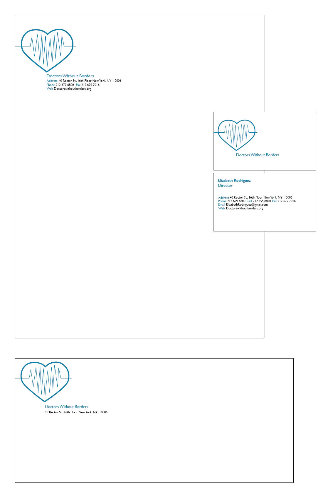
For this logo I designed a heart with a pulse going through it to represent life. The pulse is going over the boundary of the heart on both ends to imply 'without borders' in the organization's name. I used blue to represent serenity, stability and reliability. The name of the organization and information falls underneath the heart as if the heart it pointing towards it.
Type
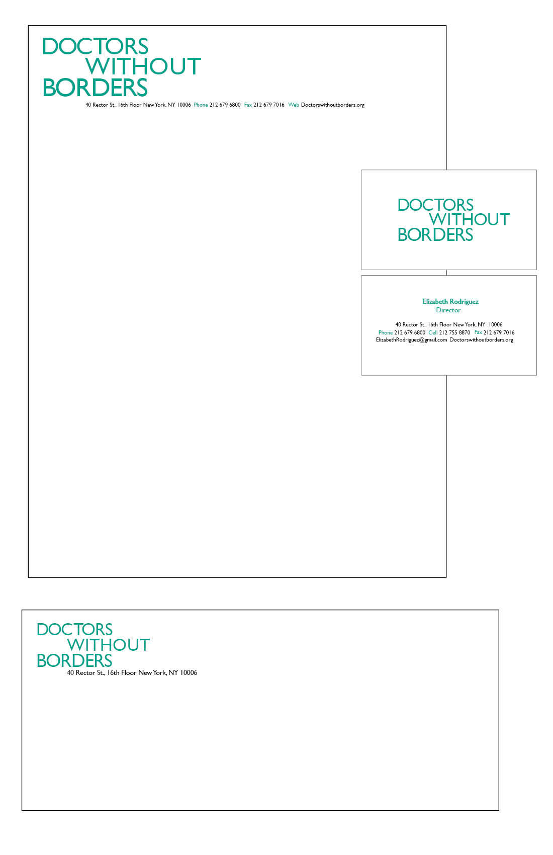
For this logo I was focused on the word 'without.' I approached this by breaking up the organization's name into three lines and aligning them horizontally. After doing so, I decided to shift 'without' to the right. This makes it so the 'out' part of the word is emphasized and is literally out of the alignment with the rest of the logo. The green in this logo represents energy, health, and life such as plants which are associated with medicine.
Symbol & Type
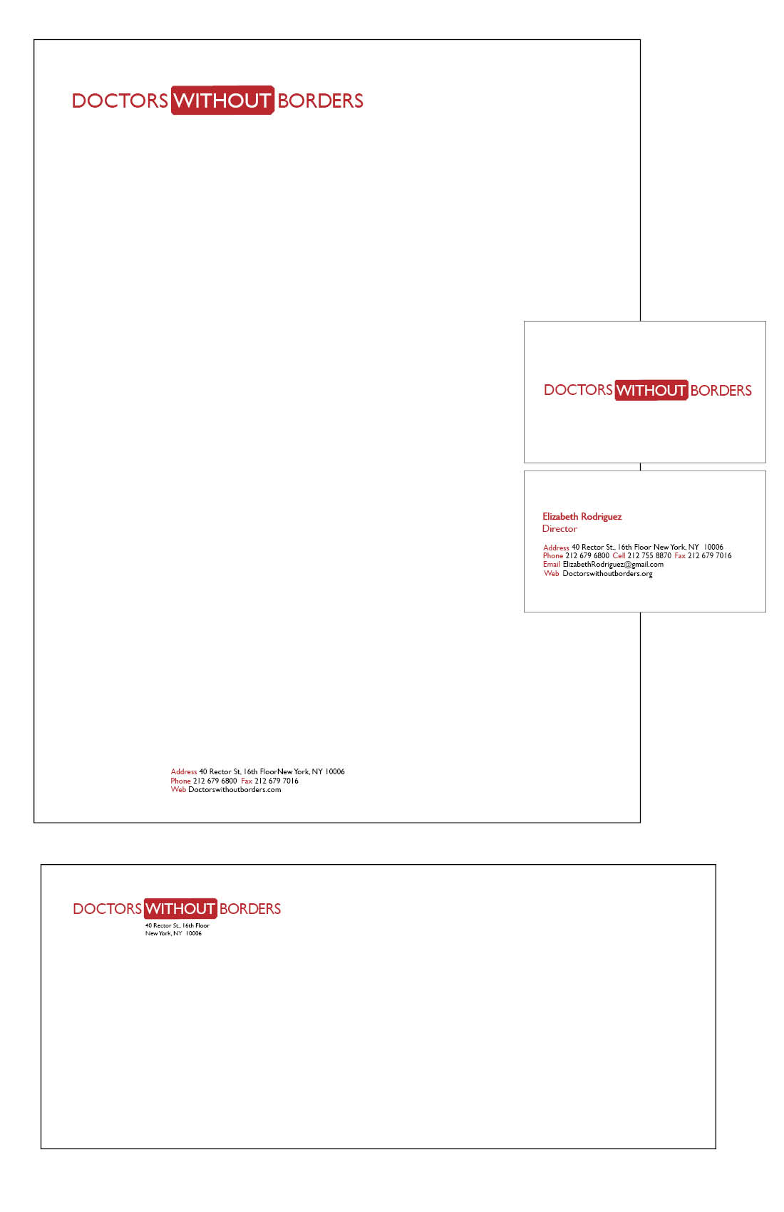
Similar to the type only logo, I chose to put emphasis on 'without'. Instead of using word play to draw attention to the word, I highlighted it inside a red rectangle. The red rectangle comes from a hospital cross, but with the vertical part of the cross removed. The red represents strength and survival, and blood in terms of medical care.