The Process
Introduction
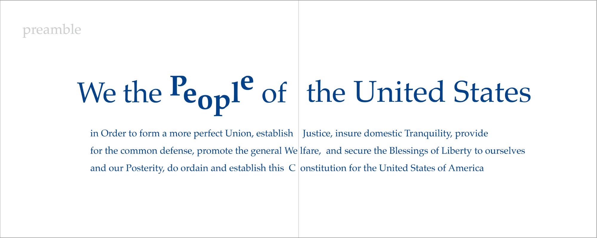
The majority of this project is done in Avante Garde- a sans-serif font, with subtle uses of serif font- Palatino, for sections such as the preamble. I alternated the fonts to communicate that the reader is now in a different section of the book. I started off with some word play on 'people' to emphasize to the reader that they are a part of this Constitution. It immediately includes the reader by directly engaging them with the document.

Designing the Articles
My first priority for each title design was to be unpredictable, therefore catching the reader off guard with what each title design brings. Looking at the relationships between the letters in each word helped me figure out what unique composition to give each of them. I played with each title from cropping, moving, and even rotating some letters. I also needed to figure out how to incorporate the word 'article' into the title in order to find a connection between the two. In a way, you can say each design has its own personality while still being in the same family tree.


Designing the Sections
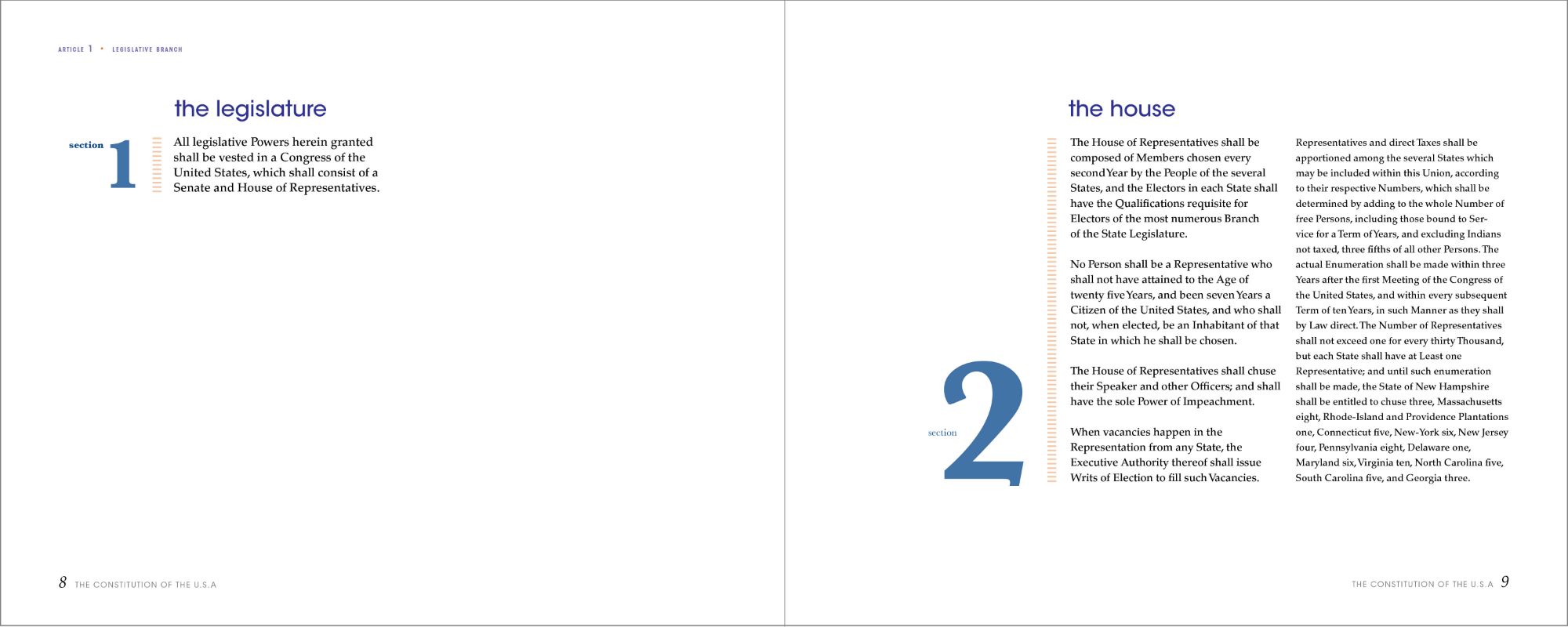
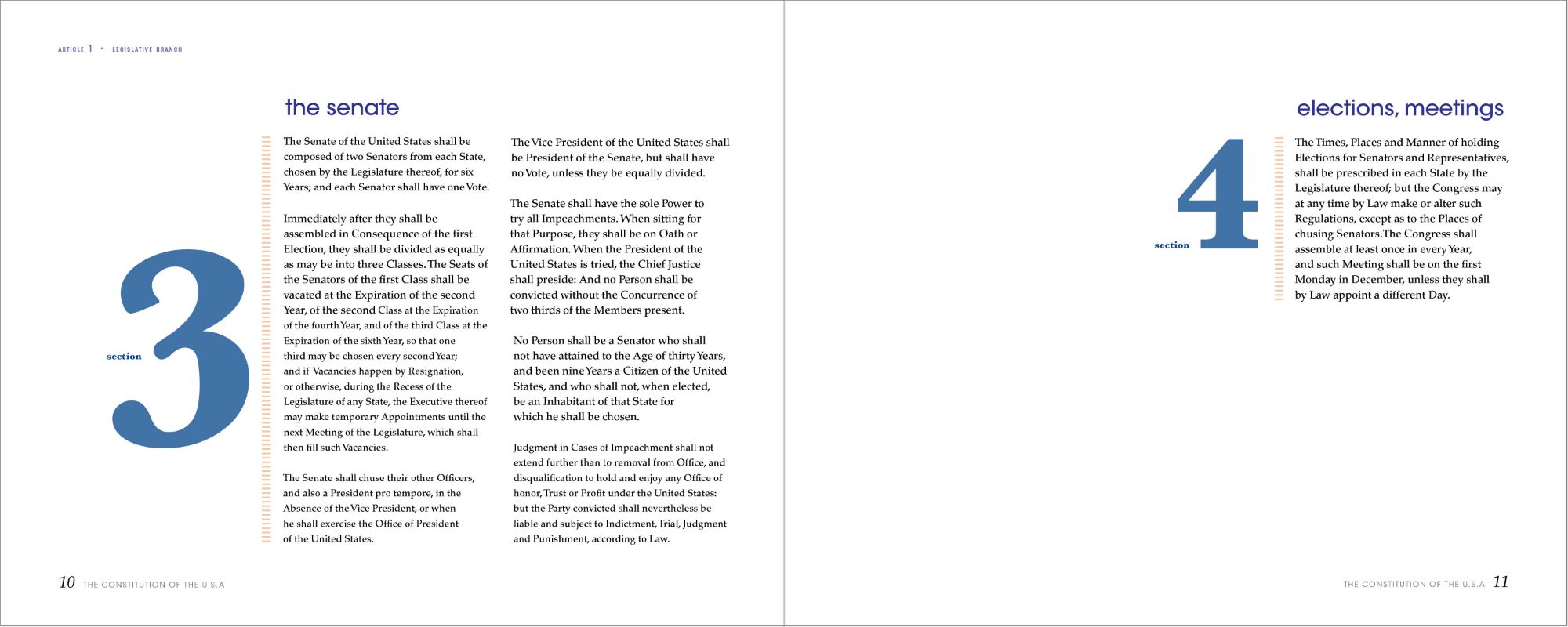
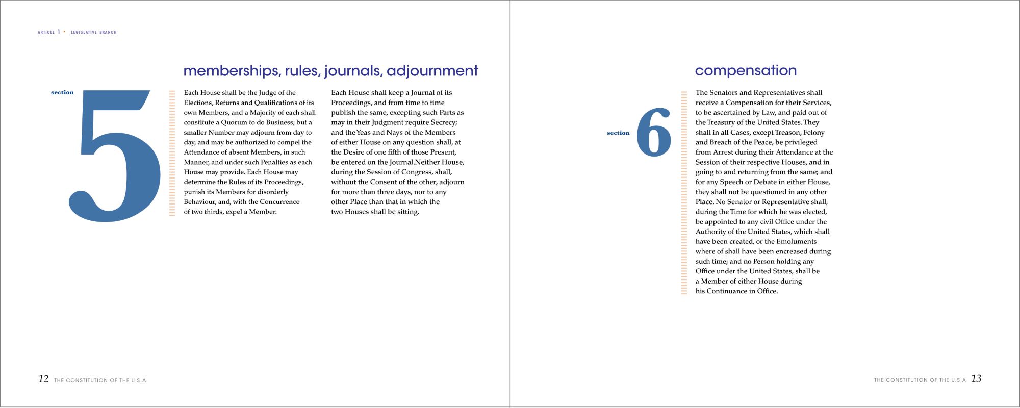
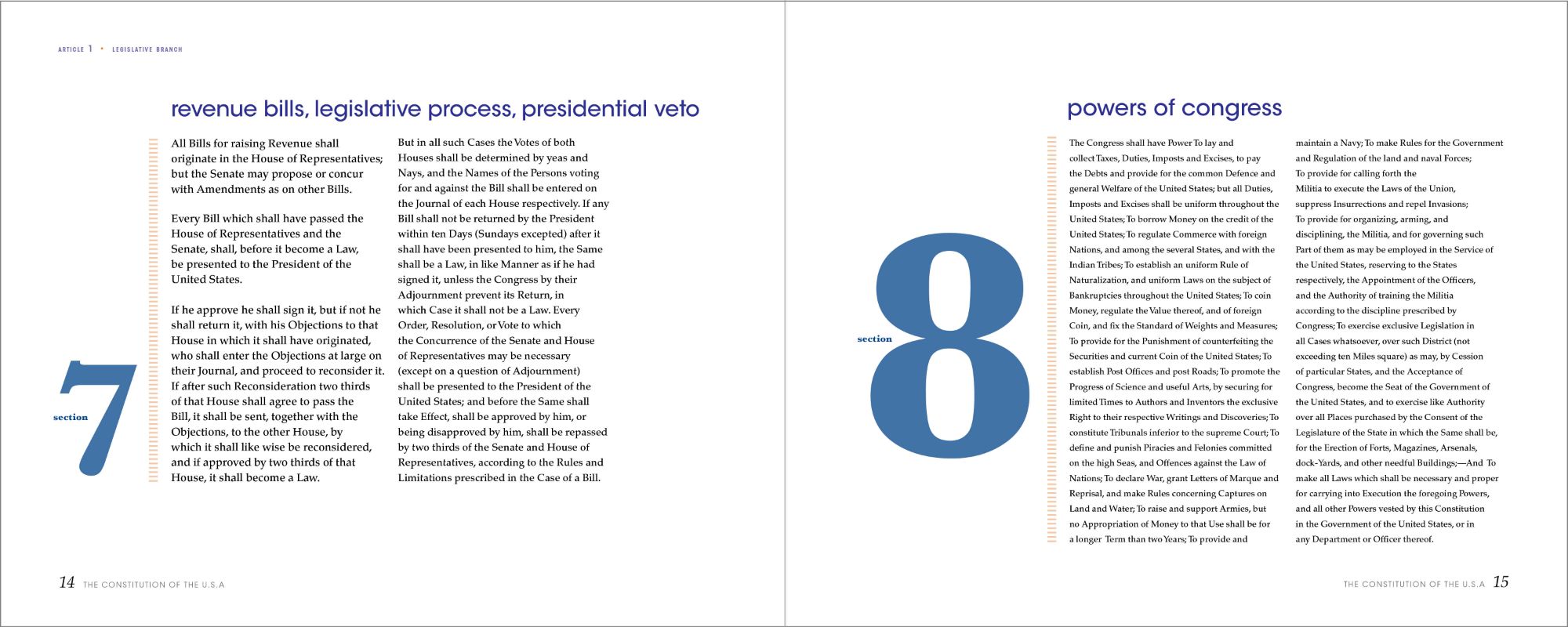
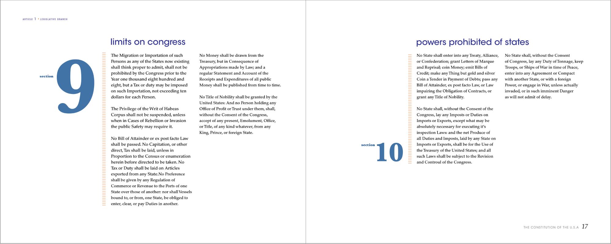
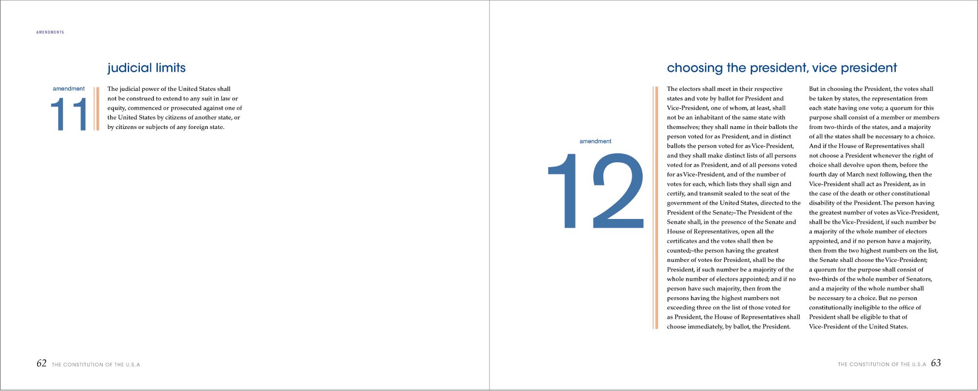
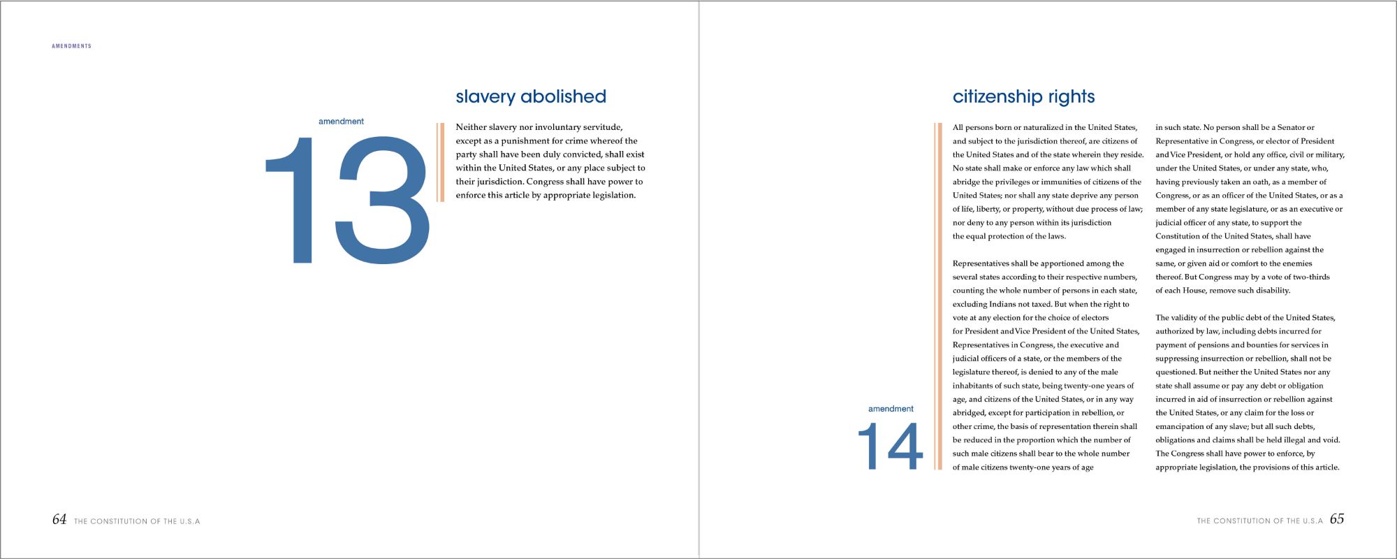
Making the sections functional was challenging due to each one being different lengths. I started the design by creating a six column grid. Although keeping the sections aligned vertically would not have worked out, I made sure to align them horizontally at the top of the page for consistency. Placements of the shorter sections vary from left to right within its own page making use of the extra space provided. The numbers within the sections differ in sizes and vertical placements along with a dashed rule separating them.


Designing the Amendments
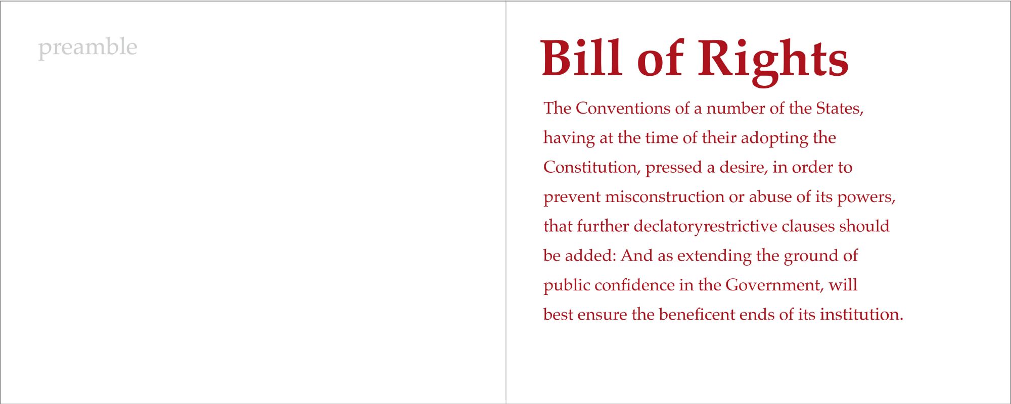
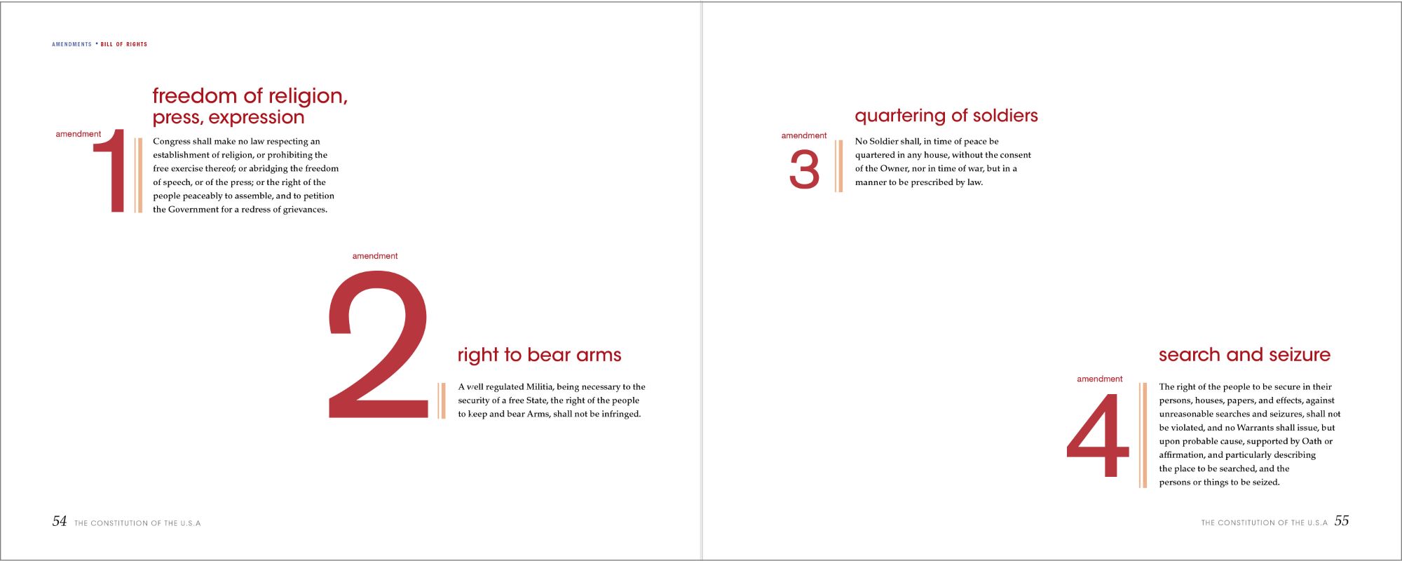
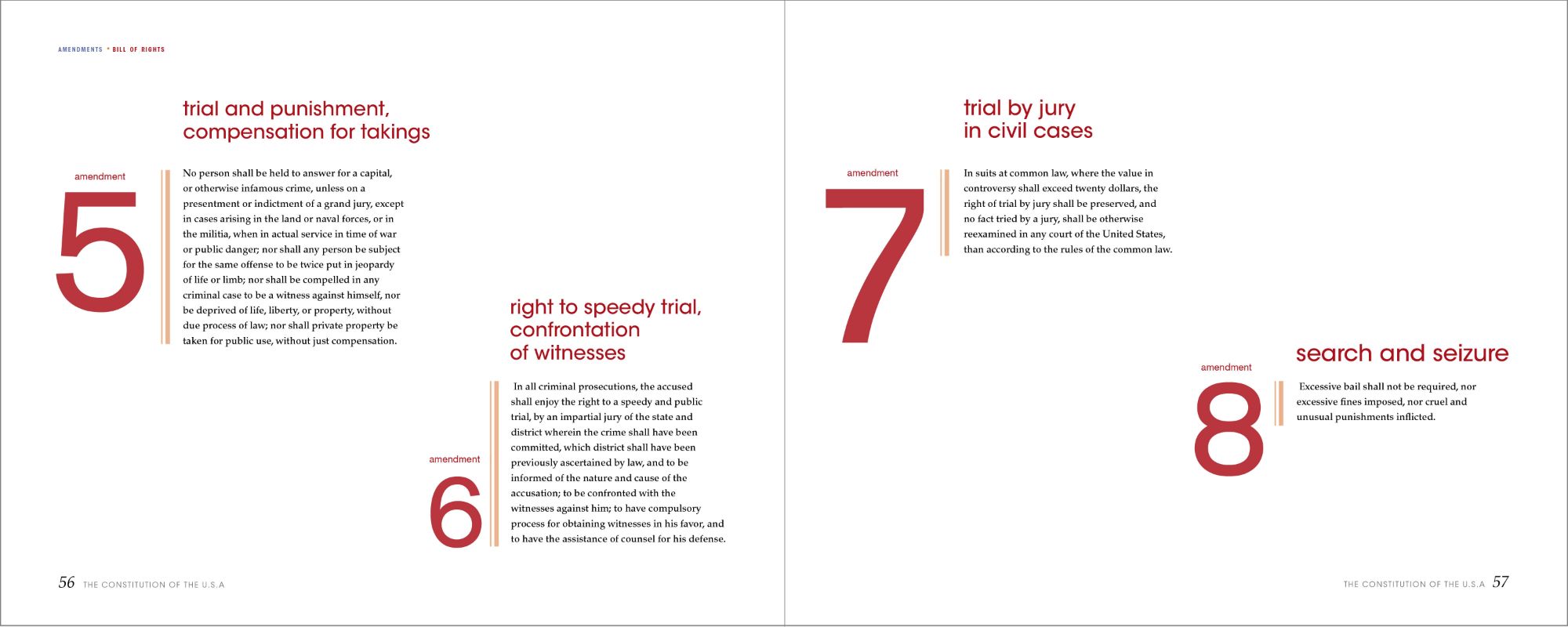
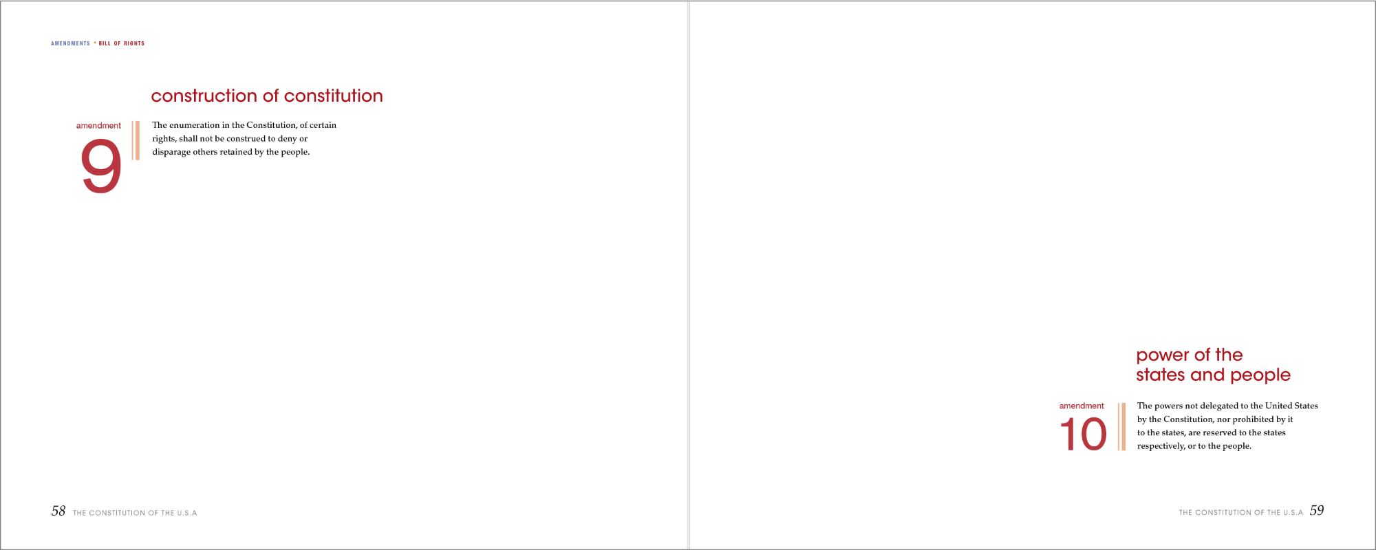
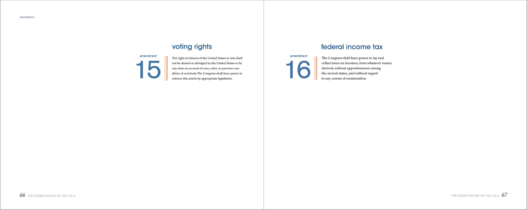
After deciding on the composition for the sections, I applied the same technique to the amendments, but with slight differences. I changed the font of the numbers from serif to sans-serif, and the dashed rule to a linear one to indicate this as a different part of the book. I treated the Bill of Rights differently to let the reader know that the first ten amendments are a separate document. I changed the color from blue to red and the pacing of the book. As for the remaining amendments, they return back to the original color scheme as seen previously, while still incorporating the new changes in elements and fonts.
