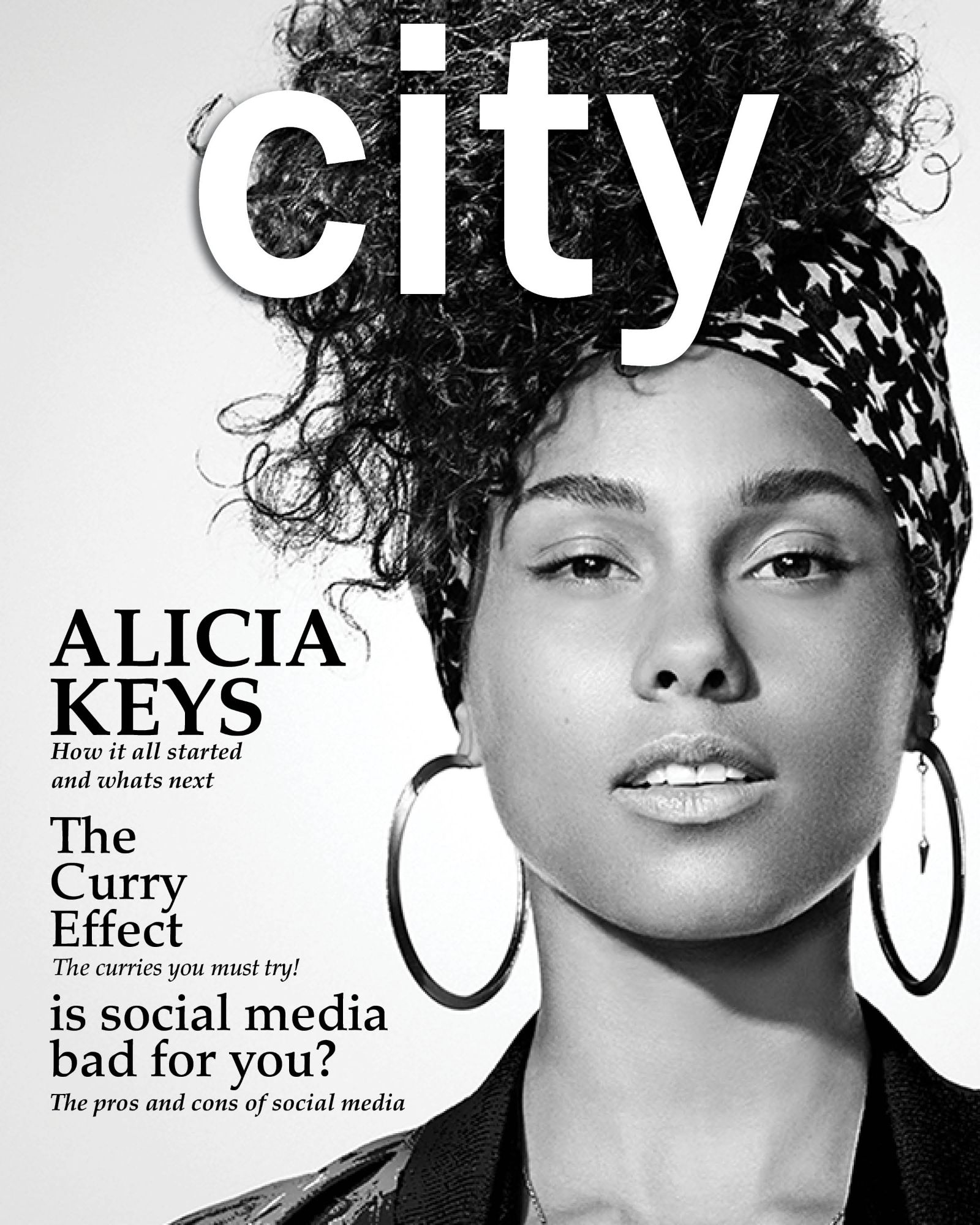
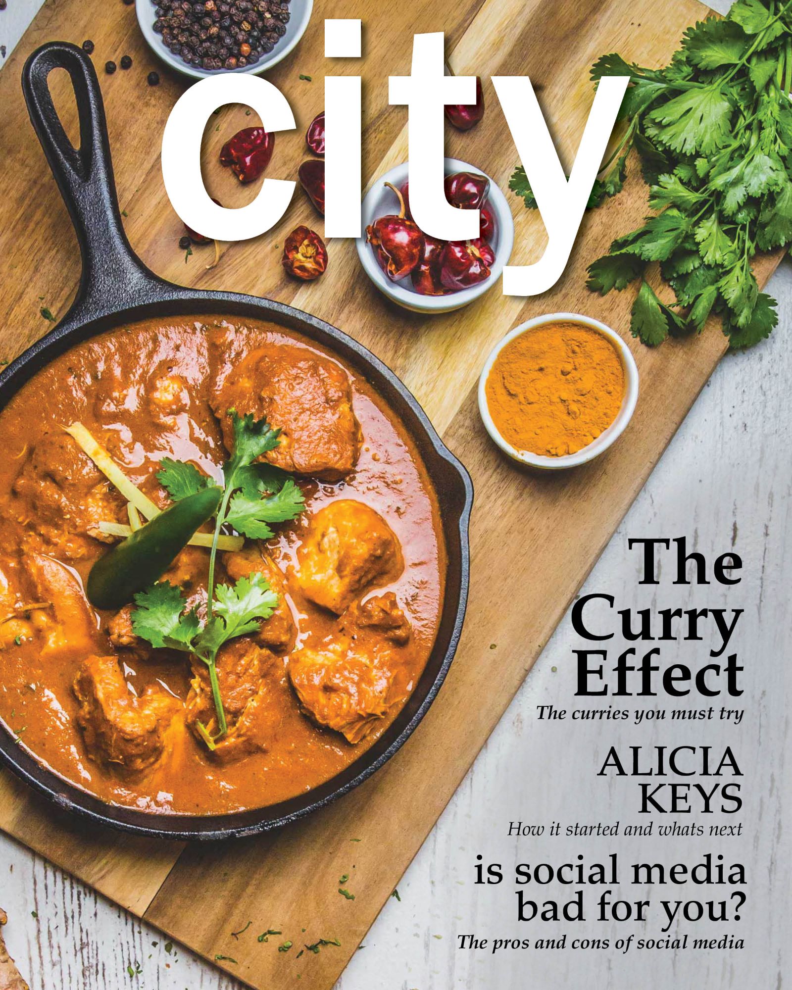
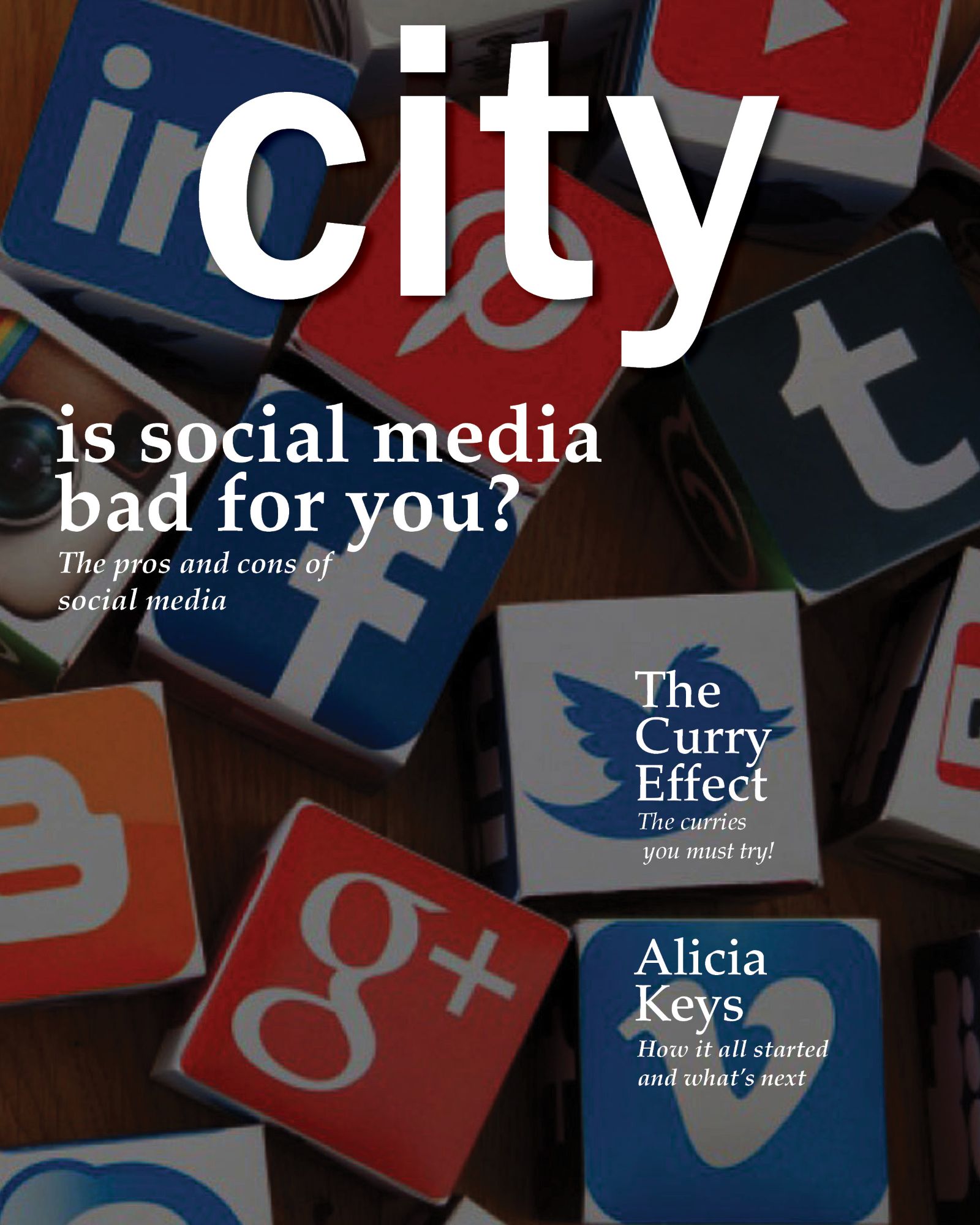
City Magazine

Project Brief

The assignment for this project was to design a magazine for New York City locals.

Behind the design

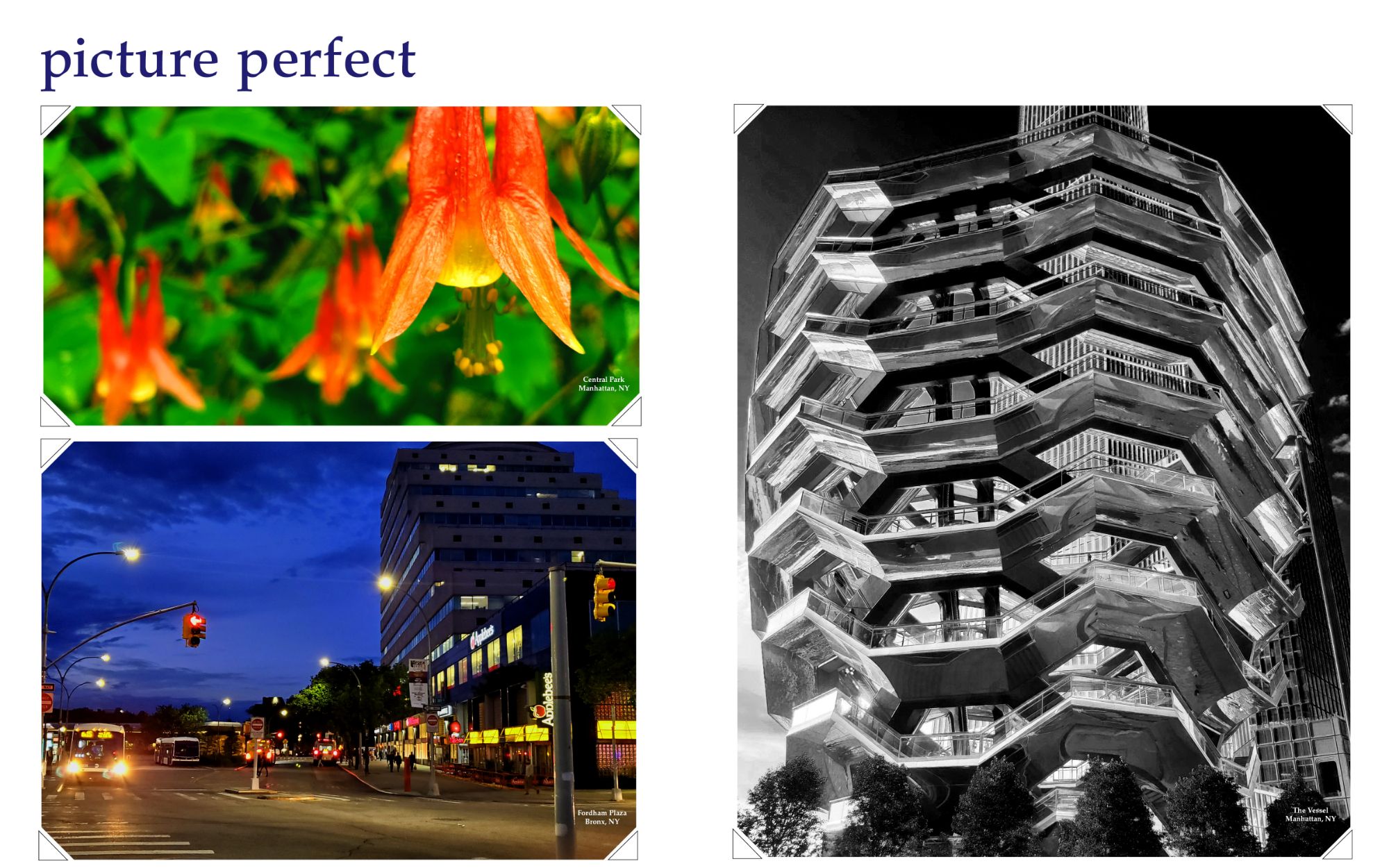
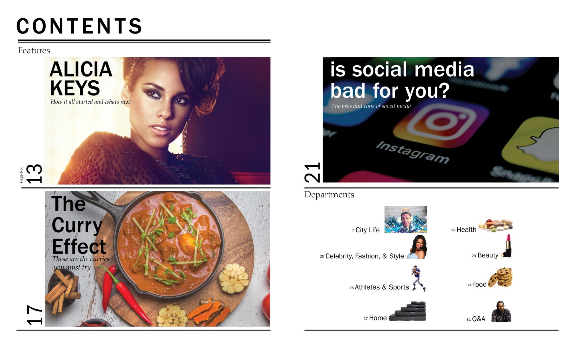
New York City is known for its liveliness, diversity, architecture, colors, and even randomness. I decided to include these themes into this magazine. My main focus was to avoid well-known, touristy areas. All locals and tourists know about the popular places. So I thought it will be much more interesting to create a magazine anyone can use if they wanted to explore local spots. This magazine consist of articles, events, photos, three features and departments. 


Software Used: InDesign, Photoshop
Fonts used: Franklin Gothic, Palatino

Introduction

The first two pages consist of an event and real quotes that I overheard around the city while commuting. I played with the sizes and colors of the quotes depending on what was said. For example, quotes that were yelled out appear bigger in all caps and warm colors such as red.

This section consist of only photography. I snapped these photos while exploring the city. I wanted to capture NYC in its truest form. From beautiful sites and views, to the immense amount of plant life that exists even in this urban environment. I decided to include triangular corners to give it a photo album feel, as if the photos are tucked into the pages. Location of the places are placed at the bottom right corner of the photo.

For functional reasons, I decided to keep the table of contents simple and organized. Its broken up into four sections and divided evenly. There's a section for each feature, and one for the departments.

Articles

My priority for this section was to fit multiple articles into one spread- similar to that of a newspaper. I used bold strokes as dividers to give a blocked in feel. Drop caps and images differ in sizes as the reader follows through the articles to avoid repetitiveness. 

Spending a day in NYC

This section is filled with recommendations for how to spend a day in each borough. They vary from events, restaurants, and places. Each borough has a dedicated color and space that display the information. I bounced the sizes of the images to keep a fun flow for the magazine and for hierarchy purposes. The title 'Boroughing' is a play off the words borough and borrowing. 

Alicia Keys

One of the three features was to include a celebrity from New York. I decided to choose Alicia Keys for this feature, who is proud and embraces where she comes from. Using text break per feature was important in this project. Giving the readers images to look at other than the article itself as they read along. For this feature, I decided to include a brief history on Alicia Keys along with two images.

The Curry Effect

Food was another feature for this magazine. NYC is known for its diversity in culture and food. For this feature I decided to provide a wide selection of curry. I also included the health benefits associated with eating curry. I wanted a looser composition for this one and decided to put the text for each curry on a different side per image.

Social Media

The third feature was my subject choice: social media. I chose this trendy topic to attract younger New Yorkers. I approached this one a bit differently starting the text on the first spread of the feature. On the next spread I included images in between the text on the left and designed an infographic for the subject on the right. This gives people plenty to look at as they read along.